

 Maintenance Connection Everywhere (MCe) · EAM/CMMS manuals
The short answer
If you 'know' the color, specify CMYK and/or Pantone colors for print and sRGB for screen.
If you are trying to create a color, use the Palette or Advanced first, then one of the Custom ones to fine tune it. (If you are unsure, the HWB is generally the easiest)
Why? Who cares?
Many companies have 'official' colors. These are often defined using a Pantone or a CMYK color, especially for logos, and sometimes for other elements.
If you are creating a report that is going to be used during a marketing campaign, often the colors for the campaign will be explicitly stated.
Other times, you just spend some time trying to find the right set of colors that give the look you want.
And perhaps most of the time you simply don't care. When you don't care – you are done reading this document. When you care … read on.
What are the problems getting an 'exact' color?
There are several aspects of colors that make it difficult to get an 'exact' color.
Quality of equipment
First, the quality of the equipment you use. Your monitor for example, or the type of paper you are printing on, the quality of your inks or your printer's inks.
Your eyes
And then, there is the issue of 'your eyes'. No one has 'perfect' vision, but some people have significantly more color deficiencies (often called 'color blindness'.) This document does not address color deficiencies, we have other documentation that deals with that and most if not all of our software takes color deficiencies into careful consideration. Most of this document is for people who have 'normal' vision and the issues involved for them.
Cheap printers and low-cost print companies
Many quick print places, like staples, use 'cheap' inks for their printing. Just like the ones you would 'normally' buy as a printer to put on your desk. These printers don't have the ability to use the special high-quality inks that commonly are provided by Pantone. In addition, some of them use Red/Green/Blue inks (sRGB) and can't even print as wide a set of colors as CMYK does.
Better printers (the ones you put on your desk)
A CMYK printer will generally do a better job of printing than an sRGB. An ink jet printer with the right paper will generally cover a wider gamut of colors than a laser printer. (Personal opinion – some printer providers may disagree.)
Better print companies
In the 1990's and earlier, these would have been considered 'the normal' print companies. These companies typically use 2 sets of inks: CMYK (Cyan, Magenta, Yellow, blacK, as you can see the K comes from the last letter of the word BlacK) and Pantone to get the best quality images.
These companies can produce the widest possible colors. For example, in the experience of the author of this document, many Greens, some reds and blues are only achievable by the inks these companies use. And 'metallic' and fluorescent colors can almost never be achieved with lower cost printers.
Displaying a report on paper and on screen
Often times any one report is desirable to be done both on a screen and on paper. The screen one will be its very nature be 'lower quality' than the paper, the colors from one screen to another will vary – often greatly. The greatest difference will be between 2 manufacturers who are using different technologies or quality of materials.
Resolution and size of the report
There is no point having a 20,000 by 20,000 image sent to your phone, while in print that will give you the best transition from color to color, your cell phone will never show that many pixels and it may take minutes or hours longer to download to your phone with no value to you. It keeps varying every year as devices have more memory and transmissions speeds increase, but as of 2018, you likely want your images in high quality print to be 8 to 20x's better resolution than the ones on your computer, and because paper can show a greater depth of color, it means your images in print can be 100 to 1000 times the size. That means if a report takes 2 seconds to download what you want, if you download the high quality print version it might take 3 to 30 minutes on the same connection to download the print version.
What are the important terms used and what do they mean?
Color space. Different color definitions have different colors that they can produce.
If you think of the color your eyes can see, think of a near tear-drop shape. Now, on the chart below, the colored 'tear' is NOT showing the actual colors that are in those spots - but representing the general idea of what colors are there. Notice that greens in most computer screen have the most missing colors, yellows are probably the best.
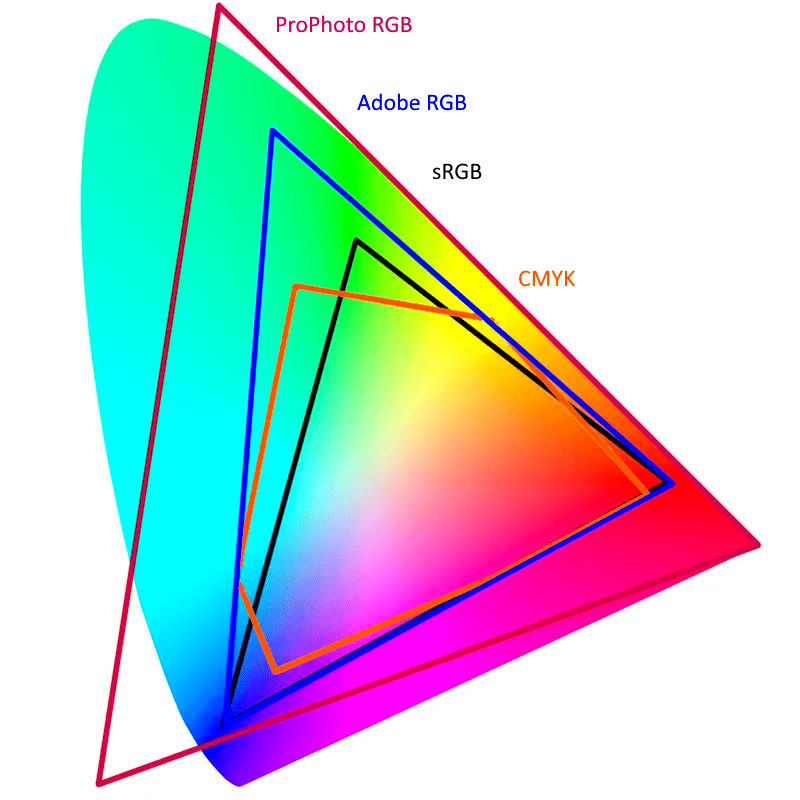
Your monitor, unless you have a very high end one, can only display colors in a triangle that sits inside that tear-drop. The triangle is normally knows as 'sRGB', and sRGB can only show about half, yes only Half, the colors that your eye can see. That means that your computer screen (iPhone etc..) can normally only show half the colors that you can see.
Each color type has a different set of colors it can't portray, and some have colors the human eye cannot see.
RGB: a way of 'defining' a color made up of light which is made up of Red, Green and Blue lights. But it doesn't define an 'exact' color. For an 'exact' color you need something sRGB or Adobe RGB. As above most screens use sRGB so you can think of the s as meaning 'Screen'. The s actually stands for 'Standard', and it was a standard created by HP and Microsoft which is used by most monitors including Apple. Both sRGB and Adobe RGB use the same 'numbers' to define colors, but an RGB number in sRGB is not the same color as Adobe RGB. This means that if you 'just' say RGB – you are talking about a METHOD of specifying a color, not a color. In practice, most people who say 'RGB' knowingly or unknowingly are actually talking about sRGB.
sRGB IEC 61966-2-1:1999 Adobe RGB HWB CIE Lab HSV HSL and CMYK are all ways of defining colors. Some of them, like sRGB and Adobe RGB only show some of the colors you can see and every color they define can be seen.
None of them show 'all' the colors you can see.
Some of them, like HSL, define many colors that your eyes cannot see.
None of these handle colors like metallic or florescent. To get those colors you need to use a Pantone ink or some other special method.
So what do we do?
First, we let you define colors for print 'exactly' using CMYK or Pantone.
Then, we have the sRGB value which is used to define colors on your screens.
When printing reports, to get exact colors, you include an ICC in the photo (anyone familiar with high end printing, or anyone who has created your logo will know that that means and what to give you to include in the report – talk to your advertising, or if you don't have one, your marketing department.
We down-sample the images (Think thumbnail but not so drastic) in reports before sending them to devices that don't need the high resolution of print.
We let you specify colors in many ways – visually, pick the color you want, manually adjust them, or if you know the numbers, just enter them in.
We include 2 methods that are not the 'most popular' ones currently: HWB and CIE Lab, because those ones are designed to be very human friendly for choosing colors. Here is a hint:
Step 1: Pick the hue first using either the palette tab in our color picker or the Advanced tab, then
Step 2: go to the custom tab and choose the HWB method of specifying colors
Step 3: fine tune the hue (H value)
Step 4: fine tune the Black (the 'tint', the B value)
Step 5: fine tune the White (the 'lightness', the W value)
Yes I know it is HWB not HBW, but the inventor of HWB also recommends this order, H then B then W.
Why can't we 'perfectly' convert from one color space to another?
It would seem that it should be 'easy' to convert a color in one standard to a color in another – after all, isn't a specific color an absolute thing? In our case, we do a conversion, and then let you adjust the resulting color based on what you want.
But since on the internet, people argue vehemently calling people nasty names because one person's conversion isn't the one they want (really, … do some searching, it won't take long to find this nastiness. Or do a search for something like "converting sRGB to AdobeRGB" and read all the complaints about software 'not correctly converting' and the responses to it!)
We at least want to explain why our color conversions may not be, in your opinion, (or ours) 'perfect' – but even when they are 'perfect' from one perspective, they are 'wrong' from another. It also explains why sometimes a 'reddish' color will 'convert' to a greenish color – and still be 'correct' from one perspective. After you see what some of the bigger problems are, if it makes you feel better, you can call us nasty names for not doing it 'correctly' (the way you would have done it.)
For most people this section will be either 'boring useless info' or 'useless trivia I just want to fix my broken machine'. If you are one of them – you can safely skip this section and just trust us that we provide you the tools to achieve the level you want as best we can and the direct answer is 'because it is impossible' and "because there really are different concepts of 'correct' conversion and even one person may have a different opinion on what is 'perfect' depending on the goals." Then skip to the next section and ignore this section.
If you have no images in your reports, or if the images are just 'basic info' and you don't care about them looking the best they can, and if your corporate policy allows for 'a fair variation' in your official colors, then again, you can breathe a sigh of relief and ignore this section (unless you are just curious.) But we support a very wide range of customers from government, military, to large traditional companies with firm policies and rules to casual entrepreneurial companies that are free spirits. Since some of our customers really care about these details – we care too.
So if you are in the 'this is important' or the 'this is interesting', read on. We are not going into all the complex math (and there is a lot) in this document (but our code does!), this discussion is a high level discussion only. If you are one who loves math, http://www.brucelindbloom.com/index.html?Eqn_RGB_XYZ_Matrix.html has the 'basic' math that would be the basis for calculating color values in 17 different RGB color spaces (He doesn't touch going to or from CMYK.)
Different color spaces define WHITE differently. They put 'white' as a specific amount of light. Wherever a color space defines white, there is no possible 'whiter' color that they can describe. But … what is perfectly pure white? How bright is 'pure' white? If you are converting from one to another, which if one defines white as 'whiter' than another? How do you handle converting all the 'whites' between their respective whites?
Different color spaces define BLACK differently. Look at 'black' anywhere around you. When you look at 'black' can you see texture? If you can then you are seeing that the definition of 'black' changes – because if you are seeing texture, you are seeing some things as 'blacker' than others. Color spaces 'define' the blackest black that they accept. In 2014 a U.K. nanotech company called Surrey NanoSystems created what was supposedly the blackest black ever, about 99.96% black, but then in 2017 they introduced for the 2018 Olypmics a blacker black Vantablack VBx2.
Both of those blacks are way blacker than any computer monitor or CMYK printout will ever be.
The upshot is that each color space picks a blackness that they call black – and none of them are even close to even the original Vantablack, and they themselves vary greatly from each other. The 'black' in CMYK is far blacker than the black in AdobeRGB which itself is much darker than the black in sRGB.
The discussion below uses AdobeRGB and sRGB, but the discussion is accurate for converting from ANY color space to another color space.
So now the problem is: If you have chosen the blackest black in sRGB, when converting to AdobeRGB, there are at least 2 possibilities for what you want to do: Do you want the blackest black in sRGB to map to the much darker black that is the blackest black in AdobeRGB? Or do you want it to convert to the exact same 'not nearly that black' in AdobeRGB?
When going from AdobeRGB to sRGB, there are lots of blacks that are blacker than anything sRGB can represent. Again there are at least 2 possibilities for converting:
- We can convert ALL colors that are 'too black' for sRGB to the same black, the blackest black that sRGB supports. The benefit of this is that 'all colors that exist in AdobeRGB will be perfectly matched in sRGB. The downside is that any colors that don't exist in sRGB will all become the same color – the blackest that sRGB has. This solution is called 'clipping'.
- We can prorate all colors so that they 'smoothly' map to colors in sRGB. The benefit of this is that variations in colors will be preserved, so if you have 5 colors, they will all be more or less 'relatively' different. You won't have 3 colors suddenly all become the 'same' color. The downside is that exactly every color will be different – well, if depending on how you write the algorithm it is possible that exactly 1 color will be the same. The biggest problems in most conversions, and is very evident between sRGB and AdobeRGB is that greens will be extremely different and skin tones are often the place that the variation is most evident. This solution is called 'scaling'.
- If you choose scaling, you need to also understand that color is represented in at least 3 dimensions mathematically, and so we have a real fun and real irritating reality. What do you do if a 'red' color is mathematically closer to a 'green' color than any 'green' is? Yes this happens! Scaling therefore has additional problems, most people would say 'I don't care if red is mathematically closer, if I have a green, it better still be green when you scale it'. As a result some algorithms for conversion add the concept of 'perceptual' equivalence. They don't just convert mathematically, they throw in a fudge factor for what the originator of that algorithm thinks is a perceptual adjustment. Of course two people may disagree on what 'perception' is 'correct'.
The same problem occurs for the 'greenest green' and the 'redest red' and the 'bluest blue'. The author of this document used to work as a professional photographer and at another point running a magazine publishing company, in both of these, these issues of colors converting caused horrific problems, and the majority fell into one of three categories:
- Skin tones
- Greens
- Logo colors for advertisers
Another problem is, the human eye and brain is wonderfully designed. It can change its perception based on current realities.
Color viewed in incandescent light is literally different than in morning light, afternoon sunny light, afternoon cloudy light, or worse under fluorescent or sodium lighting. It has become common in computers to allow you to change the color in the evening to a 'warmer' (more yellow) color. So not even can 'a whiter white' exist in one color space than another … but depending on your objectives, 'white' can be 'more blue' or 'more yellow'. Which is correct? The answer is 'both'. If you are viewing in the early morning outside, white is much more yellow, if you are viewing at noon on a cloudy day, it will be much more blue. When you are converting more than one color from one color space to another, the differences (scaling) can, at least theoretically1, be very different depending on the light the document will normally be viewed.
Also, we consider 'sunlight' to be the golden standard for color balance. But sunlight has lots of colors that, all together are called 'white', did you know if you grew up under a different start your definition of 'white' would be very different than it is growing up under our sun? Look up high CRI bulbs and you will find charts that show you how much of each color of light is included at each color 'temperature'.
Our sun does not give all colors evenly, and so our concept of correct color is based on what our sun provides us with. This is in addition to the fact that there would be 'early morning high CRI' that is different from noon or high noon-shade CRI.
But if you run with 'low CRI' bulbs, they may be missing major portions of colors. This is why when you look at colors under fluorescent light they usually look 'off', and sodium lights are even worse. But again – which is 'correct'? Is the Sun at 10am with no shade 'correct'? Geographical noon with heavy cloud? Early morning? Or is 'your' indoor light 'correct'? There is no answer, but it is important when working with different color spaces, and the difference is even more profound
if you are converting from CMYK to sRGB. Again, some will argue there is a 'mathematically correct' conversion – while others argue for a 'perceptual' (usually at what is called either 2600, 3400, 5000, 5250, 5500 or 6500 Kelvin2 – I'll leave it for you to look what all these different Kelvins means other than to say: 2600 is what your traditional light bulb provides, 3400 is what 'photographic' lights have, and 5000 to 6500 refer to noon or early afternoon light in and out of shade and are based on the.)
If you want to see how wonderfully designed your eyes and brain are, try this, start in a room that has no outside light in it. Light it up with a single incandescent bulb. Look at a white piece of paper. Then quickly take the piece of paper outside. For a brief instant, the paper will look blue – but within a fraction of a second, or a couple seconds at most, the paper will once again look white. Then reverse the process, take it into the room with the incandescent bulb and close the door quickly – for a moment the paper will look yellow, then it will look white again. The change is not because the paper changed, not because the light in the room changed, it is because your eyes and brain are able to adapt to different definitions of white. But if you print both those 'whites' on a piece of paper and view them under either light source, your brain will always see that they are different colors -even though individually your eye would have accepted that it is white.
The next problem is that a color will change how you view it depending on other colors around it. There are some famous experiments were a mathematically perfect grey appears either red or green depending on the colors around it. When companies create logos – they think about these issues in great detail, but when converting from one color space to another – the 'correct' conversion may depend on the other colors being converted. It really is that complicated for some people and some circumstances.
Putting a grey next to any large amount of red will always make it appear blue. This can also play a factor when you are choosing colors from a set of colors, even such as our palette picker. When you are choosing colors you are looking at those colors next to other colors on the color screen or in the room you are in. A bright white border will also play tricks on you eye making the color appear darker than it will be if you are going to have it next to some other colors, and when working with colors that simply don't exist in one color space but do in another, this is an important factor to consider if you strongly care how the color will look. So it really is an issue that if you are converting a color from one color palette to another, the correct conversion will literally depend on other colors around it.
The upshot of all this is,
- if you take ONE color and ignore all others,
- if that exact technical color does exist in both color spaces you are converting between
- and both are either reflected light or 'additive light'
then yes, you can convert accurately within the resolution available. But as soon as you add any of the other factors such as converting two colors, then there simply is no such thing as an 'accurate' or 'perfect' color conversion. It is simply impossible. You have to decide between all sorts of compromises or objects and then often apply a human fudge factor to perfectly convert, and chances are, if you have 5 people at most, 2 will agree that you achieved a perfect conversion.
Fortunately for us and our customer base, most of the time this really is an intellectual exercise and so most of you never will read down to this paragraph. But if you have one of the cases that matter, hopefully we have helped you understand some of the factors you have to consider to achieve what you and your company will consider perfection, and between our tools, and the tools of products such as PhotoShop (if you are including images that you want 'correct', you will be more likely able to achieve the result you want, or you will be able to hire the correct people or company to produce that phenomenal annual report you want.
A basic primer on RGB, sRGB, HWB, CIE Lab, HSV, HSL, CMYK:
This is a basic primer of the different color formats, if you want more details on each, check out a source like Wikipedia. Intro notes:
- Big tip: If you are new to selecting colors, use HWB or CIELab and ignore the rest. HWB and CIE Lab are designed to be 'human friendly' ways of defining colors, the changes that occur when you change one value 'make sense' to the human eye. If you are coming here with a color that has been specified by an external source - find the palette that it is from and use that for entering
- As discussed more in depth in a different section, there is NO perfect conversion from one color palette to another. Also, none of these express every color that you can display on a high quality monitor and print with a high quality printer.
- In many cases your company may give you 'official' colors and they will likely specify them in order of preference. Pick the highest one in your list that we support to get the most accurate color choice, but realize that on different monitors and different printers, while they may be 'perfectly' entered, they will only show up as accurate as the quality of the device and whether the color can map onto the device (monitors and printers have a different set of colors they can properly portray)
- We convert all colors to HEX for the screen so if your company gives you an exact sRGB or HEX value - use that as your preferred value to enter here.
- Do remember that we (and browsers in general) use sRGB when they say RGB. In fact, almost everyone who says 'RGB' means 'sRGB'.
- If you were given a color like 'Adobe RGB' or 'something else RGB' realize that that value is NOT sRGB. It can be very different (in general – the further away it is from pure white, the further it is from the color that sRGB will give you.) So if you are given a color as 'Adobe RGB' do not expect entering the R G and B values to give you the color you expected. Instead there are conversion tools that can do it for you.
Color Palettes
- HEX and sRGB are the same, two ways of writing sRGB3 down. Since they are the same, they convert back and forth perfectly.
- HSV and HSB are exactly the same, a rose by any other name, we refer to them as HSV because the original creator of them called them HSV, Hue Saturation, Value (B = Brightness). They express Hue (what many would call 'color') Saturation (what many would call 'amount of color') and Brightness (how much white - how light). According to HSV's creator, it is awkward to use because as the value of L changes the meaning of the value S changes. We suggest HSV/B should only be used if you are given an HSV/B value from an external source.<.
- HSL is similar to HSV. HSL has the same awkwardness as HSV but also has the problem that some 'extreme' colors are reached by some of the non-extreme numbers. We suggest HSL should only be used if you are given an HSL value from an external source.
- HWB is designed to be a 'human friendly' with H being hue, W being 'whiteness' and B being 'blackness'. The whiter it is the 'cleaner' it looks, the brighter and the lighter, the shade. The Blacker it is the more 'muddy' or 'dirty' the color, the tint. HWB was created by the same person who created HSV, he created HWB to address some of the problems with HSV, but HSV is much more popular. HWB and HSV are very close in terms of which colors they can express. The W and B values are officially in the range of 0-1 but we use 0 to 100 to make it easier for you. Here is a hint how to use it best:
- First choose your hue
- Second chose the darkness (the 'tint')
- Third choose the whiteness (the 'shade')
- CIELab covers more colors than either RGB or CMYK, it is a 'perceptual' color space. The L is lightness, the a is where on the red-green axis, the b is the yellow-blue axis. CIE Lab, like HWB, is intended to be consistent from a human perspective. CIELAB is copyright and license-free.
- CMYK is the most popular solution for printed materials. Cyan Magenta Yellow and blacK. The idea is that with printers ink, in theory you only need CMY, 100% of all three should equal black, but in practice, it is better to use as much blacK as possible and just enough C,M,Y to make the needed color. While this is important for printed materials, it is of little importance when displaying on screens. Note that CMYK is a 'reflected' color. So the bigger the CMYK numbers the darker the color.
- Pantonetm is a privately owned color for printing and has many colors that are impossible to express with any of the above, for example all of their metallic and fluorescent colors, none of which can be expressed by the above methods and require special metallic or fluorescent inks.
Footnotes
-
1: Again, for most of our customers, most reports, these factors simply do not matter. But for some they do. We don't try to solve them for you, but we allow you to use your solutions to achieve the look you want. ↩
-
2: OK, I'll give you one more detail. The Kelvin color is the theoretical color that a 'black body object' such as iron gives off when heated to that temperature. Think about a 'red hot' piece of steel – it will be in the 800 to 3200K range. So 'red hot' is actually very cold when it comes to the Kelvin scale. If you heat a piece of iron up past 3200K to say 6500K, then it will pass 'white' hot and move into 'blue hot' and if you keep going it will become 'ultraviolet hot'. So 'red hot' is the coldest 'hot' that produces any color. Also for your reference: 3200 Kelvin is about 3000 Celsius and about 5300F. ↩
-
3: Again remembering that we, like most people mean sRGB when we or they say RGB ↩