

 Maintenance Connection Everywhere (MCe) · EAM/CMMS manuals
Why icons at all?
We are sometimes asked why we have so many icons, or why we have any icons.
There are several reasons, but real one is – once you get used to using the system, the icons you use most will become familiar to you and it will let you do your job quicker because you recognize them. Unlike Microsoft and many other companies that change their icons, often dramatically, every new product release, we have, in any significant way, changed less than 10% of our icons in the last 15 years.
This contrasts with Microsoft and Google and many others like them. They have teams of developers whose total job is to change icons/create new ones. If they don't keep changing them – they are out of a job. So as a result, every couple years, the icons change. Not for YOUR benefit – but so they keep their jobs.
Consider these:
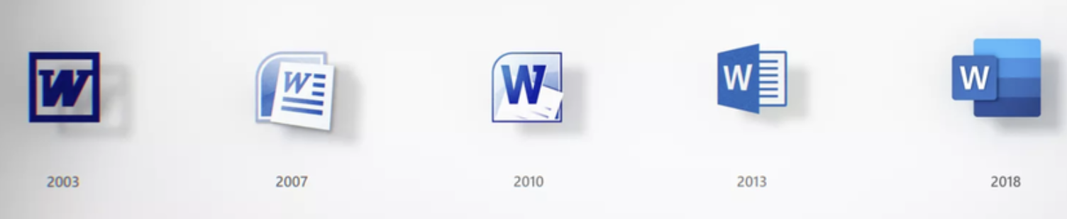
Do any of the icons after 2003 make it easier for you to use word? I would argue that all they do is make you relearn new icons every few years. BY DESIGN: We REFUSE to do that to you. We think that we should only change an icon if there is significant value for you the user. For example if we find that an icon is confusing. AS a result, in the last 15 years, as above, we have changed fewer than 10% of our icons. Yes we have added more, but the old ones are not upgraded – for YOUR benefit.
Icons are too small to see what they are.
Well, yes and no. First of all, yes – there is very little space, very few pixels to work with and the result is it is hard to get 700 different icons in a package like ours where every one of them is 'obvious' and 'makes sense'. We'd even accept the argument that almost none of the are 'obvious' without zooming in – and even then, some will probably not make as much sense to you as they do to us. One other factor is that our icons can't conflict with the legal rights of others who have created icons, so our icons must be created by us (about half) or they must come from a library we purchased and have rights to distribute (again nearly half) or they have to be public domain/non-licensed (a small percentage.)
Icons also have to work for people who can see color AND for people with color deficiencies.
Another difficulty for us, we avoid having 'English' on icons as much as possible. We make some exceptions, for example "!" is not a symbol universal in the 7000+ languages in the world, but among people who use computers it turns out that the meaning of ! is fairly universal. But for icons that are really the 1st letter of a word – we try hard to avoid those. Again, some exceptions for things that are very familiar, such as some symbols on our Editor, that use characters that are common in Word and its competitors.
So here is our design decision: We try to have a range of colors (for those that can distinguish color) and we try to use colors that make sense (red for stop2/danger, yellow for caution, green for good, blue for benign) and we try to have shapes that have some connection to their purpose or failing, if they are for something that is common use for many people – at least memorable. We avoid using letters on icons as much as possible. Within one page, we try to have a variety of icons that are different enough in color and shape that they can easily be distinguished.
And here is the trick you can use: For icons that you are going to be working with a lot and recognizing the icon – zoom in (choose a bigger size in accessibility settings) then look at the icons closely to understand what they are trying to convey, then go back to your normal working size. It is amazing how the brain can 'remember' colors and patterns, especially since unlike Apple, Microsoft and Google, we don't go changing them for random reasons every upgrade or two.
Why not change icons once a year to the latest Microsoft, Google or Apple fad?
Obviously I have hinted at the reason in the way I asked the question.
When Windows 8 came out, we had several people we were connected with push hard for us to change our 'mostly 3D' icons to be the 'flat' icons that Windows 8 was using. Then, when Apple a year later was accused of copying the Windows 8 look at feel by going to flat icons, the pressure got harder, and many other software developers started switching their apps over to the flat look too. We admittedly considered it, and we played with the icons, but working with users testing, we found that the change only had one benefit – it made our application look like Windows 8 and Apple iOS 9. It didn't make it easier to use, and for users that had been using our system and were used to the old ones, it made it harder initially.
Eventually, it turned out we were correct, it was a 'fad', and while some of those design elements exist in some software still (for example the 'start' menu of Windows 10) it turned out that Microsoft and others have moved away from that fad and are moving back (or so it seems at the time this document was written) to having more 'depth' in their icons.
Similarly, in 2016 Google started playing with changing the meaning of 'greyed out' to mean 'you can click here'. To be honest, we have no idea why they have done what appears to us to be the worst UI decision of the decade and we have chosen not to follow it. Update: In 2018 it appears that Google is reversing that trend. Update 2020: It looks like everyone other than a few slow to move companies have realized that 'gray/grey'd out' to mean 'you can click here' was a really dumb idea.
We've made a few changes admittedly, we followed the 'moving dots' fad of the 'I'm working' For a few years, right or wrong, we decided given our market base, that using a pair of gears (or a single gear where space is tight) rotating makes more sense than some random dots going around in a circle.
Some of our icons have been around 20+ years in MCe and they are getting boring.
Yup. We don't apologize for that. Their purpose is to help you do your job, so yes, a few have gotten boring, and we promise to try hard to keep most of our icons that way for the next 15+ years.
Do you want to put in your own icons?
We have considered allowing companies that buy our software to load their own icons to replace ours. We have built our system more or less on the idea that someday someone is going to hate our icons enough that they will be willing to pay for us to allow them to put their own icons in. Each generation of our product has gotten easier to do that, but so far no one has even asked for a quote on what it would take for them to put in their own icons. So at this point, our icons are 'bad enough' or 'outdated enough' to cause this to happen. Some day we may just offer this feature. Interesting, as of 2020, we have made this offer for the past 5 years and while some have commented on reading this paragraph, not a single company was interested in paying even $1 to change them.
But someday, I hope an aquarium company or aquarium destination park will decide to do something up with all fish animals. Or a zoo or pet store chain do one up with animals. That would be a lot of fun. Hard to USE the software, but very pretty and a lot of fun to build.
Notifications, Upgrades, Feedback
Visual Studio is one of those: Hey, I see you've decided to work - do you mind if I shut you down for a time period that might be long or might be short while I do an upgrade? If not, don't worry, I'll ask you again tomorrow morning when you start work again.
Lots of software on the web asks you for feedback as soon as you install it. Our goal is to have as few as possible delays for upgrades when you really want to work.
2018 Update: We now download the upgrade in the background and then 'magically' upgrade you when you switch to a list page or any one of several other actions. You typically notice a ¼ second blip as the upgrade happens. In fact it was such an unnoticeable event, it turned out especially for our testers, that it was too small – they never knew when an upgrade happened, so we added an ! on the connection icon so that you could see when an upgrade was about to happen.
Ideas that never made it, decisions that were discarded
Many of these were just plain humorous, they were never considered seriously, but they did come out in brainstorming sessions.
Others were serious decisions, such as the gun emoticon which came up when we were looking to include in our product the top n popular emoticons, as below, we made a conscious decision to not have 'all' the top n emoticons because of the problems caused by Apple's political statement with it.
Others we explain in greater detail, in part so that when people ask questions or challenge our decision we can send them there.
And others are for a reminder for us, so when the suggestion comes in the future to make such and such a change we can read our reasons and think about whether the change would be a net positive or a net negative, or at least so that we can think about the consequences and tweak the idea to get rid of the negatives.
MCe's dev team spends many hundreds of hours per product release cycle on UI decisions. We take a lot of factors into account for each and every decision, things like:
- How will it work on a cell phone? A Tablet? A desktop/laptop? A multi-monitor device?
- How will it work for color-deficient (often called color blind) people? And yes, we do consider more than just the Red/Green deficiency
- How discoverable is the feature? For example, on almost all lists in our system, such as a WO list, you can double click or double tap on it and you will be taken to the edit page for it. But … this is not easily 'discoverable'. Or if you have an Apple device, around version 10 they hid the delete button so you have to swipe to the side to even know there is a delete button. When features are not discoverable, we try to do 2 things: 1 We give you an alternate way, such as the pencil icon, to go edit. Then we give the option (usually at a corporate level) to delete that edit button if you prefer to just use the double click all the time. We try to make 'hard to discover' UI decisions only ones that are really convenient once you know them, but not required for basic use of the system.
- How easy is it to do with a finger and with a mouse? We have several 'tricks' to help with this, one is we default to different sizes for everything (starting with MCe 8.1) so you can make things on a touch screen 'bigger'. The double click on a row is to help with this – you don't have to 'hit' a small target to do the thing you most commonly do.
- How cluttered does it make the screen. We have a lot of features, and it is always a challenge deciding between how to offer a feature and thinking about how popular it will be in general and how important it will be to a small number of our customers.
Do we always make the right decision? No. Our version 8.0 product was our first version designed to work on tablets as well as cell phones, we think that the product worked quite well on most cell phones and most tablets, but a year after we released the product it was brought to our attention that because the iPad Mini is 20% smaller than regular iPads, everything was too small on the iPad mini for most technicians.
But we stand on our track record – and we feel that because wo do think for hours and hours about these factors that on average we provide a much better UI than most other products, even if it isn't obvious, and we make a point to learn from our mistakes – hence, with 8.2 and later versions, we think the product runs fantastic on iPad minis – and even better on iPads and phones than it did in 8.0.
Our biggest struggle is what IBM used to call 'Never confuse sell with install'. Our salespeople want it to be as simple as possible so it doesn't confuse people in the sales cycle, but our users want it to have all the features 'they' need. So what do we do? We use a very configurable UI design, some changes you can make easily yourself, others we have tools to help you do at relatively low cost.
Rejected icons
The devil is in the details
 Instead of double clicking on a row or clicking on the pencil icon. What if we had used this icon, as a pun, for going to the details page?
https://www.flaticon.com/packs/file-formats-icons
Bugs
 https://publicdomainvectors.org/en/tag/svg
Pistol = Water gun
We do not include the pistol as one of our emoticons (though you can still enter it if you want using your cell phone etc..,) even though it was one of the top favorite emoticons at a time when we were trying to decide which emoticons of the nearly 3000 to give you 'easy' access to. Why? Because Everyone except Apple shows it as a real gun. Apple1 shows it as a very clear 'water gun'. Apple did this as a political statement (at the time they bluntly stated so) but it is interesting that it causes several problems. The most serious might be for Apple users:
- If you enter it on an Apple device, you might think you entered a cute children's toy with an emotion that is 'cute', and along with certain text, it may appear to be harmless fun. But on every other device, that same text comes with an image of a real gun, could come across (and has in some real-world circumstances) as a credible threat!
Our solution, we don't provide an easy shortcut way of entering this confusing emoticon.
Footnotes
-
2: We are aware that Red does NOT have that same meaning around the world. In some countries it means 'wealth' for example. But we discussed this with several people in several countries and they told us "But because of universal road signs, stop lights and because all computer systems are USA centric – we all know the 'meaning' of those colors the way you do, so don't change them – we expect them to have those 'wrong' meanings on computers and if you correct the colors – it will confuse our users." So … we have followed that advice. ↩
-
1: If you are using emoticons outside of our product, some other platforms like WhatsApp and Samsung OS decided in 2017 to follow Apple's lead. So our recommendation, either avoid ever using the pistol emoticon, or use it with extreme caution – your intentions can be greatly misunderstood. ↩