

 Maintenance Connection Everywhere (MCe) · EAM/CMMS manuals
Why?
There is one general reason something is greyed out and some specific common causes.
The general reason is: The feature is not available to you right now 'because' of some reason.
Why don't we hide it if it isn't available now?
Because we like you. When tools hide a feature because 'right now it isn't available' I spend a lot of time trying to remember 'now where WAS that feature', By being greyed out I don't waste time looking for it, instead I spend the time trying to figure out why it is greyed out.
Material design introduced the idea that 'greyed out means they are where your attention should be". Dumb.
Side note, optional reading: Google introduced Material Design on June 25, 2014, at the Google I/O conference. It was initially codenamed "Quantum Paper" and aimed to create a unified, tactile design language for digital interfaces by drawing inspiration from real-world materials like paper and ink. The design system was developed to enhance consistency, usability, and visual appeal across Google’s apps and platforms, including Android, web, and iOS. The problem is that Google and most others came up with some really weird ideas like "Greyed out buttons mean that they are available for clicking". Now if you've been around computers more than a week before June 25th 2014 - you "know" that greyed out buttons mean "you can't currently click this" or "you can't currently type in here".
Fortunately, within about 2 years most companies decided that this part of Material design should be ignored, greyed out means 'not currently available". This is partly because Google is reported to pay for changes to everything, they don't congratulate you for finishing something and leaving a good design alone. No, they want you to keep changing it. Most of the time this Google practice is irritating, but in this one case, it means that Google only kept to this silly idea for a year or two, then they moved on, and back to 'grey means not available'.
Unfortunately, some companies that fell for the full Material design - typically web sites created in 2014 and 2015 - still use greyed out to mean 'you can click here'. Mostly because they designed their web sites when this was the fashion de jour. Companies that don't maintain their sites well, if they went down this road, never went back to fix this bad UI.
MCe took a lot of the good parts of Material design, but we never did, and have no intention of using 'greyed out means click here".
Now let's look at some specific reasons your feature may be greyed out.
Data not sufficient/valid:
This is most common when creating something new, the SAVE or CREATE button may be greyed out and all you have is the cancel button and the entry fields. This is because some fields are 'required' and until you enter the required data, you can't create the new record.
Similarly, it can happen that two or three things can't all be used at the same time, so only one is available, the other(s) are greyed out. In this case you will often have a dropdown list or a radio button to pick which section should be available and which ones should be greyed out.
Or there may be a checkbox that, until you select the checkbox, you can't enter data in the field or fields related to that checkbox.
The feature requires a network connection and your network connection is not available.
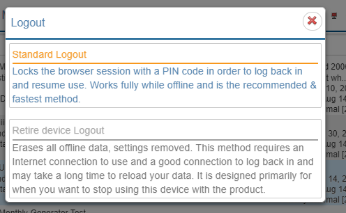
For example, the Sync and Release WO's buttons on the main menu, or the 'Retire device Logout' all require a connection.
Similar to above, I am using an offline only feature
The Criteria only work with ONLINE queries, queries where we are getting data live from the server. It is used to filter the list that we are asking the server to give us so that it won't take so long for the server to return values to you.
So when you have selected one of the 'OFFLINE' queries, it is grey'd out.