

 Maintenance Connection Everywhere (MCe) · EAM/CMMS manuals
Browsers we support (more documentation elsewhere)
These are browsers we try very hard to always run on. We test against their pre-release (canary) versions whenever possible so we hopefully know about problems before they occur1.
- Safari on iOS, current and previous version.
- Edge (Chromium) on Windows desktop/laptop, current and previous version.
- Chrome on Windows desktop/laptop, current and previous version.
- Chrome on Android, current and previous version.
- We continually test Shift Vivaldi and Brave, Brave is the one we have the hardest time because they keep doing things that break us.
Notable browsers we do NOT support:
- ~~Legacy Edge on Windows desktop/laptop, current and previous version. ~~We dropped support for this in 2025 more than 5 years after it was considered not available.
- Chrome on iOS (this is lipstick on the Safari, WebKit, engine).
- Edge on iOS (this is lipstick on the Safari, WebKit, engine)
- Edge on Android (this is lipstick on the Chrome, Chromium, engine)
- IE 11 (this is designed specifically to only run old fashioned applications and has a lot of known security flaws – Edge is the 'upgrade' to IE 11 according to Microsoft). We had features (in service requester) that up until early 2026 we supported on IE, but no longer.
- Any browser in private/incognito mode – those modes remove features (on purpose) that we need
- Any browser in HTTP URLs (too many features have been removed from non-HTTPS for us to reasonably run in HTTP anymore.)
HTTPS that isn't HTTPS:
If a certificate error is present this means your connection is encrypted but none of the benefits of https are active. This is also a special mode of the browser and contains many bugs that prevent normal operation since it is an emergency state and not intended for actual use. The browsers restrict features in this mode just like they do in HTTP.
Best new tricks and features in 12.1.4
New table view. In Work orders, go to the 3 dot menu on the WO list, the look at the new table option for display. If you are on a desktop and your window size is wide enough, you'll get it by default.
Best new tricks and features in 12.0
AI. Ask to trial our AI features.
Best new tricks and features in 8.4
The 'landing' page when you login, both after logging out with a pin and when it is your very first time in is our Calendar. It shows your listed holidays and today's date. If you have a license to one of our WO module it also shows the WO's. From there, if you have a small enough number to fit on the calendar, you can double click to go directly to the WO, or you can click on it to bring up more information, then go to edit it.
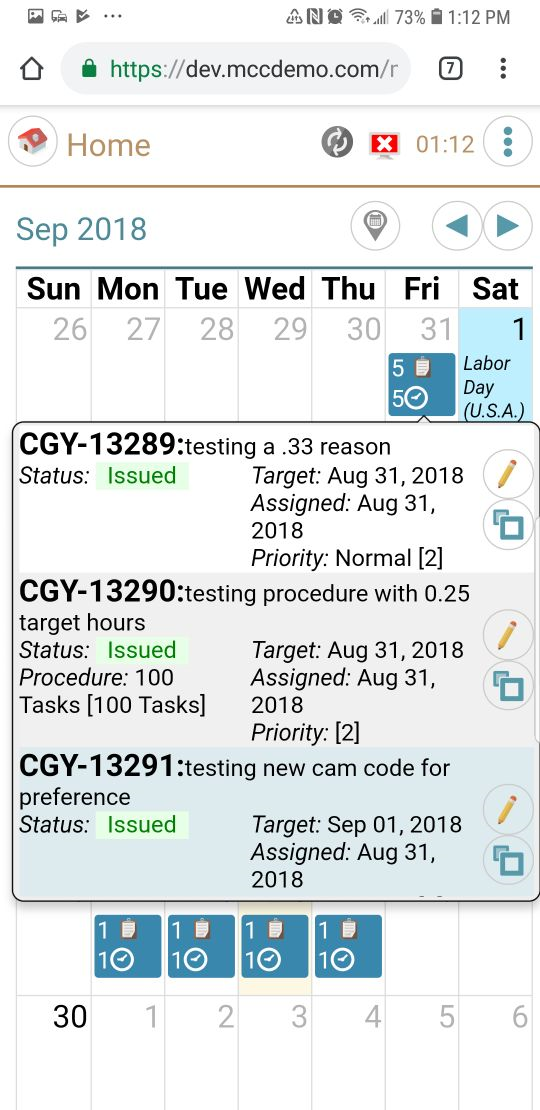
If you have 'too many' WOs, then you will see a COUNT of the WOs and the amount of time that you have been assigned to work on them. If you click on it, you will get a list that looks a lot like our WO list page (which is still available), and from there you can pick the WO you want to go into and go there.
If you enter a WO from the WO list, you will return there when you go 'back', if you enter a WO from the calendar on the landing page, you will return there when you go 'back' from the WO.
On a small screen (e.g. cell phone) you will see a smaller amount of info. For example on the screen on the left, you see 5 followed by the work order icon, telling you that there are 5 wo's for that day. Then you see 5 followed by a clock, telling you that there are 5 hours work total in those 5 work orders.
On a bigger screen, you will see more.
The cream-colored day (Sept 25) is telling you 'today'
The light blue background day (Sept 1) is telling you that your company has it listed as a 'holiday'
Best new tricks and features in 8.3
Administrators can turn lots of things off if you don't use them. This can be by groups of people or even just specific individuals. So, for example, if you have the 'right' to delete an asset, an administrator can turn that off for people and then turn it on only for people who should be allowed to delete an asset.
8.2 lets you double click on most places (other than buttons) on the WO and other list rows to edit. This will do the same as clicking on the pencil, so you can 'double click' on the pencil as your default.
We have lots more online data that you have access to if you have an internet connection. So you can now 'choose' costs or any asset in the tree instead of typing them in.
Logging out has been made simpler and clearer. The normal logout is available on the main (left) menu, then you use your pin or password to log back in. (Your PIN and Password are never stored by us, we use a one way encrypted hash.) https://docs.microsoft.com/en-us/windows/security/identity-protection/hello-for-business/hello-why-pin-is-better-than-password
Warning: We use the most secure options available to us. This means there is no way for us to recover your PIN if you forget it, and there is no 'administrative back door to bypass security'. The only real way around it is for an administrator to reset your password to something new, and then come back in (while online) using that new password.
When you first logout, you will be asked for a PIN, as above, the hash of the pin only is saved.
When you are 'done' with the device (selling it, putting it in the garbage), go to configuration and choose the 'retire device' option. This will save changes then wipe all your data. Note: If you have purchased rights for multiple users on one device2, all users should go through the retire device step so all of their data is wiped as well.
We recommend you NOT use the 'retire device' feature on a regular basis, when you use that, we clear settings of things like what lists we have cached for you to use offline, and you will have to reset these if you log back in on this device.
If you have more than one database you access you have a list of databases to pick and you can switch back and forth without logging out. More important, you can have two or more databases with local copies of data without having to sync going back and forth between them.
If you have a lot of databases you connect to, there is a 'tiny' features that will be of value to you: The ones that are 'stared' are the ones that you currently have offline data for already, so you can switch to them without any delay waiting for a sync.
Note: If only ONE database shows up on the list, this means that you have ACCESS of some sort to at least 2 databases, but you do not have any MCe licenses currently on that or those other licenses. So you are provided the database picker – but there is only one choice currently to pick from. As soon as your administrator adds licenses for you to those other database(s) they will show up on the list.
Prerequisites
- MRO 7.x or 8.x has been installed (MCe 8.2 is compatible with both MRO 7.x and 8.x)
- MCe 8.3 or MCxLE 8.3 or newer has been installed, along with licenses
- a user account in MC for you has been created
- your user account in MRO has been given permission to use MCe/MCxLE
- You have been given a URL to go to, something like https://myserver.com/mce
- We require HTTPS. There is an ability to run with many features disabled by the browser in HTTP, contact support for assistance. Note that this is a 'by the hour' support for any setup and related issues when running under HTTP. Browsers are taking away more and more features and giving more warnings if you use HTTP. Think of the S in HTTPS as 'secure'..
Logging In
You want to be on the best and fastest connection you have access to. There will be a lot of one-time processes such as caching the app and data that happen when you login, and bad connections increase the chances of corruption which is inconvenient at best.
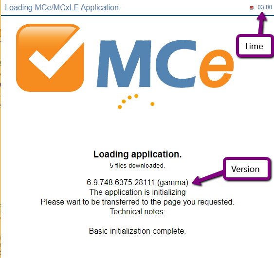
You will be presented with a loading application screen. If you have a previous version, initially it will show that version number. So on the authors machine at the time of taking this screen shot, the previous version was a version numbered 6.9.748….
One other recommendation for installing: Installing can take longer than some operations and many phones and tablets have a very short timeout, 30 seconds to 2 minutes. This means, as you are undoubtedly aware, that after that time if you haven't touched the screen, the device will shut the screen off, and if you aren't running a multitasking computer (i.e. Windows 10) most devices stop working until you turn them on again. On some devices, iOS in particular, this may mean you have to restart the install.
To make the installation process enjoyable, we recommend you temporarily change the auto-off time to the highest setting they have. You can always change it back after.
So now that you are ready simply 'go' to the URL you were provided with.
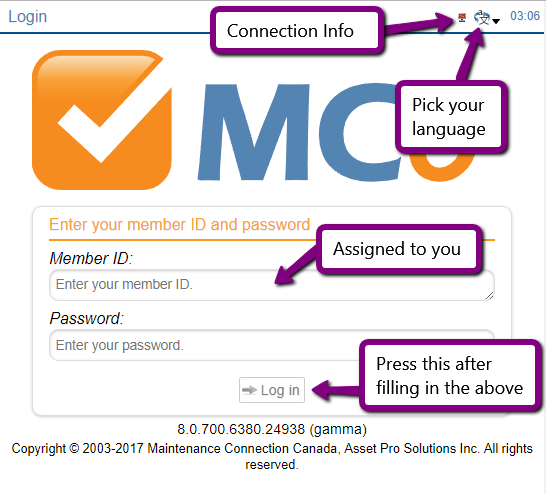
You will be presented with a standard screen to login with. After entering the required info, press the Log In button.
Passwords are case sensitive. MyPassword is not the same as mYpAssword
If your administrator set it up for more than one language and you don't want to use the default language, click on the language picker icon in the top right.
The connection Info will initially be red, because no connection to the server is attempted until you press the Log in button.
On this system, only French, English and Spanish are permitted. There are dozens of languages you can choose from in MCe/MCxLE if your administrator allows you access to them.
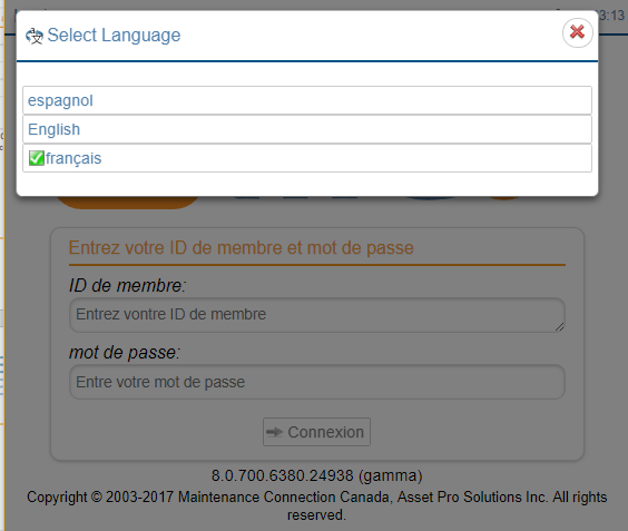
If you choose a different language, the screen will immediately start to change to reflect that language.
Note that some things, like the copyright notice are legal phrases, so they remain in English. But throughout the system there is very little of the application that does not change.
Note also that the language gives the language in THAT language. So if you choose Chinese, you will not have to select 英语to get back to English! English will be read as 'English' not as 英语.
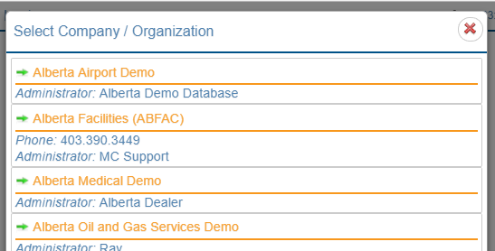
If you have access to more than one entity/customer database on the server, you will be presented next with a list of them to choose from.
If you only have access to one (the normal case) you will be taken directly to that database.
The initial login will sync your base data such as WO and Asset. The 'Sync in progress' screen will give you an indication on what the sync is working on.
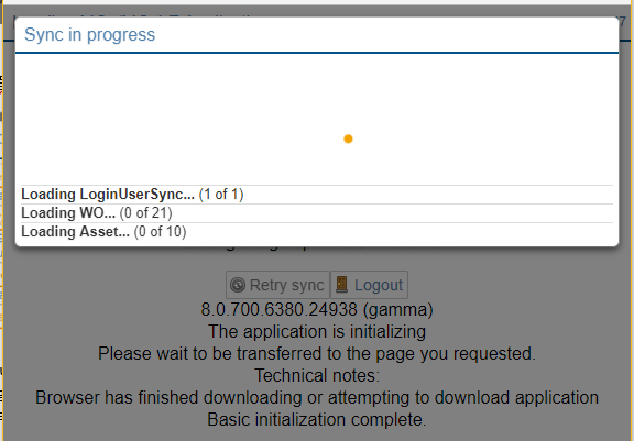
If you lose your internet connection, you may have to refresh the browser and try again. Or you may just have to choose sync from the options, depending on how far we got before you lost your internet connection.
Notes: If, when you log in, the language changes, it means that the database you selected does not permit the language you logged in with. Talk to your administrator to turn on the language you need in the database you are working with.
Logging Out
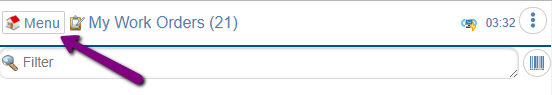
To logout, you need to be on a page that shows the Menu button.
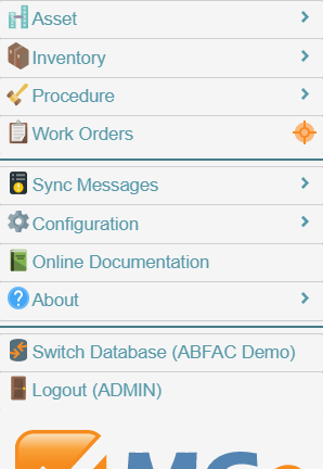 The exact choices on your menu may vary depending on what packages you have access to/your company has purchased. Below is a typical one. Any choices (like Connect below) that are greyed out tell you that that option is not currently available to you.
The choices that are grey'd out are because they are not available when there is no connection to the server.
We have greatly enhanced the logout in version 8.0 and that is why it is available even though the screen shot on the left was taken when there was no internet connection.
To logout, you obviously click on the button marked logout.
If you have never entered a PIN, you will be prompted to, this allows you to login even when offline. Note: We never store your password or PIN, we store a one-way encrypted hash of it.
Things you'll see on lots of screens
For the following, we are going to use some screens as they were in MCe Version 8.0. The purpose here is not to show the most up to date WO pages, the purpose is to illustrate general features that are found throughout the system.
All Screens
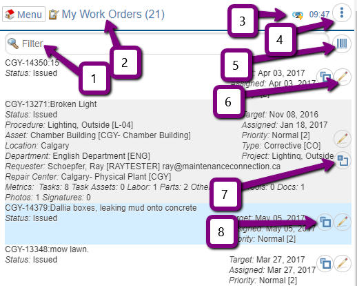
Filter
We provide filters on most lists. These do a text filter to restrict which items show up on the list. We search through all the 'common' text fields we have available in the list to find rows that match.
The filter may be 'simple' (just search for text string) or it may be more complicated with a criteria button to the right of the filter text. The criteria button will be greyed out (unavailable) when you have an 'offline' query, it will be available when you are running with an 'online' query. This allows you to tell what data should be requested from the server based on several 'logical' restrictions, so for example, you might filter by repair center. The specific criteria for filtering will depend on what the list is showing, the criteria for WO is different from the criteria for Assets for example.
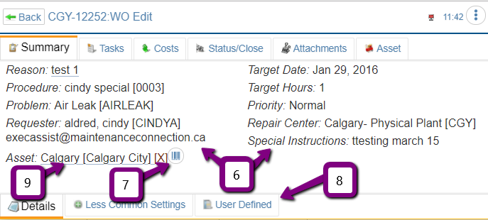
2: Title
Click on the title bar to find out more about the page, especially on pages where it isn't obvious.
3: Connection Icon
There are 4 icons, very similar in concept with the previous versions.
![]() This icon tells you that the last time we checked (we typically check every several seconds or any time we need to talk to the server) your connection to your server was working correctly.
This icon tells you that the last time we checked (we typically check every several seconds or any time we need to talk to the server) your connection to your server was working correctly.
![]() This means that you manually disconnected. This means we can't talk to the server because you have told us not to. This will save battery power and conserve cost data charges and, if your internet is flakey (on and off a lot) or very slow, this may speed up a fe different things because we won't even try to connect to get more data.
This means that you manually disconnected. This means we can't talk to the server because you have told us not to. This will save battery power and conserve cost data charges and, if your internet is flakey (on and off a lot) or very slow, this may speed up a fe different things because we won't even try to connect to get more data.
![]() This icon means that the last time we tried to connect to the server it wasn't available. It normally means that your internet connection is not working.
This icon means that the last time we tried to connect to the server it wasn't available. It normally means that your internet connection is not working.
![]() This means that we have tried over the past couple minutes and haven't been able to connect to the server. As above, this normally means that your internet connection is not working.
This means that we have tried over the past couple minutes and haven't been able to connect to the server. As above, this normally means that your internet connection is not working.
For more information, see your Am I connected? What are those little icons? In the manuals menu.
4  : Three dot hamburger menu
If this button is here, there are some other features related to the current page that are available, things like changing the sort order, creating a New Service Request.
5  : Barcode entry
Fields with this icon can have values entered in by barcode. (Most fields can by going to edit and there will be a barcode button there, fields that we think barcodes will have particular value have them right there. It is available on all devices, so if you have a laptop camera or a USB camera, you can use it.) This is a good time to mention again that Administrators can turn off features, so if your company doesn't use barcodes – turn them off for now and they won't use up any screen space.
See a separate white paper for lots of useful info if you want to use barcodes. How to set up, which codes to use and why and much more. This document only talks about the different UI locations for barcodes and the subtle differences.
List Screens
1: Filter
Type some letters to filter which records to show. Most visible and some common 'not visible' fields will be searched.
6: Edit row
Starting with MCe/MCxLE 8.0, we often allow 'common edits' right on the list itself. But to get access to everything you can edit for that row in the list, you hit the edit button.
Starting with 8.2: If you double click/double tap on most areas of a list, it will take you to the same place that clicking on the pencil on the line take you to.
7: Expand
If a list has extra somewhat commonly useful info to read, the row will have an expand button, click on it to see more about the row.
8: Collapse
If a given row is expanded, such as the example that arrow 8 is pointing at, the icon changes to show you it can be collapsed. And while the icon technically is the opposite between 7 and 8 they are similar enough that normally you will just click them naturally without worrying about noticing the difference because you can see whether the row is expanded or collapsed.
9: Filtered
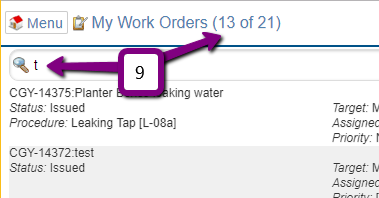
If you start to type (or paste) into the filter box, rows that do not match what you have typed will be removed from the list. The numbers at the top change to show you how many rows are visible as well as how many rows are in the list in total.
Detail/Edit screens
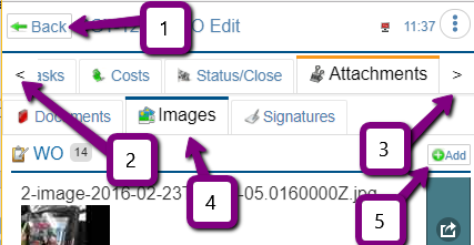
1: Back and Cancel buttons are frequently found on the header
Most places have the back button because most places auto save as you enter in fields. Typically things like 'new' or where major changes happen based on your choices (close) will have a cancel button instead because nothing is saved until you choose to save.
2 & 3: More tabs
On phones the screen will be too narrow to show all the tabs on some screens, these buttons (arrows) let you scroll left and right to see the other tabs. If you are on a wider screen and you make the window narrower or wider, for performance reasons (a significant benefit), we wait until you hit on a tab to redraw based on the new width.
4: Sub tabs
Sub tabs are less common, but found in several pages.
5: Add button
Many 'lists' have an Add button. Some have just the green plus, others have plus and the word 'Add'
6: Multi-Column Display
If you have a wider screen (Tablet, Laptop) wherever reasonable you will find your screen switches automatically to 2 or 3 columns. When displayed on a smaller screen (most cell phones, tablets in portrait orientation
) they turn into one long column just like the older versions of the product display. So nothing is lost for cell phone users, but huge benefit for those with wider screens.
7 : Barcode quick entry example
Here is an example of a field that can be entered directly via a barcode without going to an edit popup first.
8: Bottom tabs
Some tabs will have 'bottom' tabs. These are less common than sub-tabs, but give a place for the less common settings (some named exactly that!)
9: Editable fields are underlined
If you see a field is underlined, it means you can edit it. Some will edit by giving you a text box, some by giving a dropdown, others by a specific picker like a date or date/time picker
Editable popups
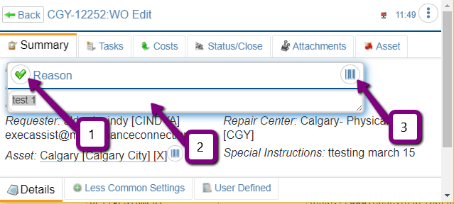
1  : Done, click here
When you are done you can click on the checkmark or anywhere outside the dialog – such as on the next field you plan on editing. This lets you go quickly to your next task.
2: Data Entry here
Nothing surprising here … this is a text field you can type in anything you want.
3 : Barcode to replace or add a value
If the text is highlighted, a barcode value will REPLACE the text. If text is NOT highlighted, a barcode read will be added after the cursor. So you could type in something like "Part " [hit the barcode button, scan the part] " was broken." Or you could, by having everything selected, replace the entire field with the barcode scan.
Special case: WO task list.
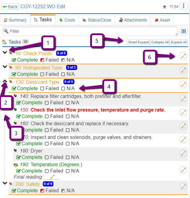
 1: Header expanding for management of tasks
When you have 100's or 1000's of tasks, this feature is particularly useful. If you use headers in your task list, the tasks will be hidden until you expand them. If you are an 'expert' you might want to just look at the headers, if you are a beginner or working in an area not as familiar to you, expand the header to see the tasks.
 2: Headers can be collapsed
When done for now. Collapse them.
3  : What belongs to the header
The dotted line makes it easy to see where the header ends.
4: Header summary info
![]()
![]()
![]() The half filled in square tells you that SOME of the tasks have that value set. If it is set this way and you click it, all tasks will be set.
The half filled in square tells you that SOME of the tasks have that value set. If it is set this way and you click it, all tasks will be set.
![]()
![]()
![]() The check mark tells you ALL the tasks have it set.If it is set this way and you click it, all tasks will be unset.
The check mark tells you ALL the tasks have it set.If it is set this way and you click it, all tasks will be unset.
![]() The empty box tells you NONE of the tasks have it set.If it is set this way and you click it, all tasks will be set.
The empty box tells you NONE of the tasks have it set.If it is set this way and you click it, all tasks will be set.
5: Smart Expand
This will expand the first header that does not have all of its tasks with either complete, fail or NA selected.
6  : Edit the row
This button lets you edit the details. As of MCe 8.2 you can also double click on the row to edit it. We still leave the pencil so there is a 'visible' way to edit the row, but if you prefer to not have the edit row pencil button showing and just use the double click method, your MCe system administrators can easily turn off the display of this button in the License: User permissions page.
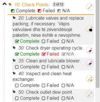
![]() If you entered previously a picture or signature and have edited info in the task, the icon shows with the full black square.
If you entered previously a picture or signature and have edited info in the task, the icon shows with the full black square.
![]() If you previously entered info in the task, but no pictures or signatures, the icon shows the pencil with a lower right orange triangle.
If you previously entered info in the task, but no pictures or signatures, the icon shows the pencil with a lower right orange triangle.
![]() If you previously entered only a picture or signature in the task, the icon shows the pencil with and a upper right purple triangle.
If you previously entered only a picture or signature in the task, the icon shows the pencil with and a upper right purple triangle.
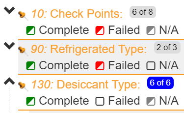
In addition, on headers there is a x of y indicator. This tells you how many rows have one (or more) of complete/failed/na selected. This allows you to quickly decide which headers to look at its tasks in more detail.
So you might see that the tasks:
- Under header 10 have 6 of the 8 with at least one of complete, failed or n/a selected on those 6 rows. This implies there are still 2 tasks under header 10 that need someone to look at and decide whether to complete, and/or fail or set them to n/a
- Under header 90, at least 2 rows have at least one of complete or failed on those two rows. We know there are none with n/a because the n/a box is empty.
- Under header 130, all 6 rows have at least one of complete or N/A selected on each of those 6 rows, so you know that header 130 has been fully checked by someone. You will also notice that the box the 6 of 6 is in changed colors to very quickly draw to your attention which have all tasks touched and which have some remaining.
User accessibility, text too small? Text too big?
We spend a lot of time making our application as ideal as possible for users with various issues such as red/green color weakness (often called 'color blind'), we did this by never using color as the only indicator of information. Color is always a secondary indicator, not the only indicator.
We took away the screen 'flashes'. With a more modern UI, the need for things to flash to tell you something is happened is not as necessary, and makes it easier with people subject to epileptic, vertigo and other issues, while still giving lots of info for people who do not have those issues.
Also we started to bring it with 8.0 a major new feature. That is the ability to scale almost everything in our application. As of Version 8.2, it is now complete.
To access this, go to: Main Menu, Configuration, Accessibility Configuration
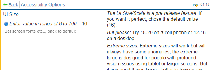
In general, we find that users of cell phones prefer something in the range of 20-24, and users with large screens and mice prefer something in the 12-16 range.
The bigger the number you pick, the less information that will show up on the screen, but the larger the text size (so you can put your reading glasses away) and the larger the buttons (for those of us with so called 'fat fingers'.)
But if you have a good sized screen and a mouse, you will likely prefer a smaller number because it is easy to hit small spaces with a mouse and you can then get more on the screen at one time.
Taking pictures
There are a lot of really powerful features in our picture taker. With 8.2 we are thrilled to say that iOS fixed their bugs and iOS now runs our picture taker as well as any other device.
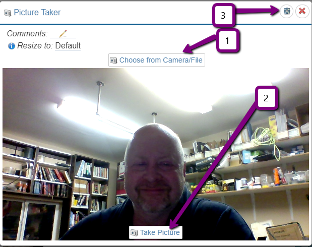
When we go to take a picture, we start running your video camera.
The first time you do, the browser and/or the operating system will prompt you for permission. (On browsers that, for a while longer, permit it on HTTP you may be asked EVERY time, on HTTPS, the browser should store your choice – if you choose no, it will be remembered, see below to fix.) Note: the Safari browser prompts every time after you reload the application (start the browser, hit refresh.) This is a decision Apple made that is different from all the other browsers and we have no control over this.
1: Choose from Camera/file
If you want to use the still camera (mobile devices like phones) or pick a picture that you previously took with your camera (most devices) click on the Choose from Camera/File button and follow your browser prompts.
2: When you see what you want, click the Take Picture button
Click this button and see the next screen shot for more info.
3  : Many pages have settings
The gear indicates there are settings you can change for how this tool works.
4. Current selected picture, if you click on any of the dots it will take you to a different picture
5. The first picture (3 seconds before you clicked) that we collected for you
6, The picture at the time you clicked (this is selected)
7. The picture taken just before the currently selected picture
8. The picture taken just after the currently selected picture
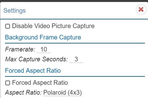
If you choose to disable Video Picture Capture, your browser will revert by default to the other options your browser allows for taking a picture or loading a picture from the drive – the specifics depend on the browser and hardware.
Framerate, default 10, means we take 10 frames per second. The maximum depends on your hardware, but typically is in the range of 30 to 100.
Maximum capture seconds means – after how many seconds do we 'throw away' the older frames. The default is 3 seconds because that should give everyone enough time to realize they saw what they wanted to take a picture of and then click the take picture button.
Forced aspect ratio is useful if your pictures are going to be used in a report that requires a specific layout. For example, you may want to have a wider and shorter image for many reports. Without this, you would have to rotate your camera.
Have you ever noticed that a lot of people take videos that are tall and don't fit on a 'wide' tv screen? This is the type of situation that Forced aspect ratio is trying to solve. By forcing it to a so called 'landscape' (wider than tall) aspect ratio, you'll take pictures that fit on reports on screens that want a landscape.
How do I fix it when I told the browser to not give access to the camera?
When you first go in to use the camera, you will likely be asked by the browser once or twice for permission to use your camera. If you choose no or block (depending on the browser) it will never ask you again. In each browser, there is a way to 'un-block' it. The browsers keep changing where they do these settings.
For example on Chrome 59, go to: Settings, Advanced, Privacy, Content Settings, Camera, List of choices – unblock
Clicking on PDF's to 'view' them
Evey browser is a little different, some open them to view, some save them in your downloads then let you click on them to open. Some have 'this' set of features, some have 'that' set of features.
Starting with MCe 8.3 we have introduced our Native PDF viewer. Starting with 10 we made it broadly available.
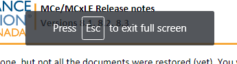
For our non-English users, when we switch you to full screen, some browsers show a message telling you how to return to regular screen, and applications like ours have no control over it – we don't control the color/style and we don't control the text.
The exact text (and whether there is text) depends on the browser and which language you have selected in your browser.

Footnotes
-
1: But running against the pre-release doesn't always tell us what we need to know. For example, the Chrome 69 Canary showed us that we were going to catastrophically stop working against HTTP URLs, but when the 'real' Chrome 69 came out – they had NOT taken away the feature they said they were going to. Also, in October 2016, we ran fine on the Canary version, but when it became the 'real' version, Chrome had a bug that broke us for 2 weeks before they rushed a fix through. ↩
-
2: This is a feature intended to be introduced in MCe 9.0 ↩