

 Maintenance Connection Everywhere (MCe) · EAM/CMMS manuals
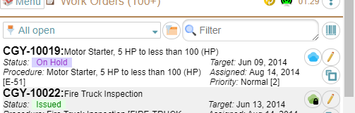
For many people, the first 'page' you land on is the WO List.
The WO List is also used in our documentation to explain all the general things that ar in most or all lists in our system. If it has been awhile since you read it, we recommend you first read the quick start then come back here.
This document deals with the specific things that are not mentioned in the quick start. So again, you should read that first because we are not repeating that general information and explaination here.
The MCe 3 dot hamburger menu has several choices:
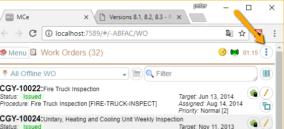
Note that, as in the image some versions of some browsers also have a 3 dot hamburger menu1. Our 3 dot hamburger menu is the one that the arrow is pointing at in the pickture below:
The 3 dot hamburger menu gives you access to several options.
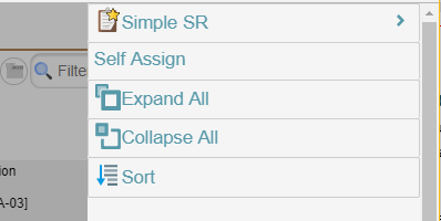
The ability to create a new 'simple SR' (SR means Service Request. Once approved, a Service Request conceptually becomes a Work Order, so creating a new SR is how you create a new WO)
Self Assign put you into a different mode designed to facilitate finding WO's to assign to yourself. See Self Assign documentation for more info.
Expand all show more info about each Work order in the list. This includes showing all the text for reasons that are very long.
Collapse All. If you want to see as many work orders at a time and just need the summary info, you can Collapse All to only show the basic info about each one.
Sort will be discussed later in this section of the manual – but it gives you the ability to define how you want to sort everything.
Moving down we have the tools to select which WO's to show.
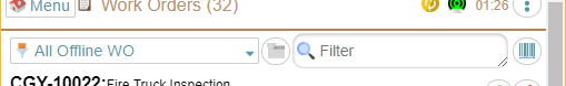
Here we have the All Offline WO query selected and the criteria picker is greyed out (because it is an offline query)
You may or may not see the query picker depending on which level of WO package you have purchased and what restrictions your administrator(s) have placed on your account. A common restriction is you automatically see the 'All Offline WO' list except when in Self Assign mode.
Next, the button in the middle is the criteria picker. In the above screen shot it is greyed out – because it is used to decide which WO's to include in the list from the server and offline queries are 'offline' so the criteria selector doesn't apply.
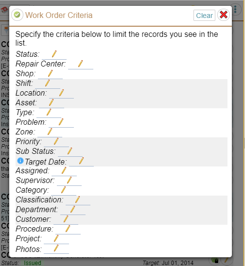
\But in this next screen shot, the criteria picker is available because the query selected is an online query.
The list of criteria you can pick from (below) may vary depending on setup and which exact version you have, but they all work similar:
If you specify one or more criteria, only rows that match that criteria will be presented to you.
So for example if you pick 'Repair Center 1' and you pick 'Priority 3' and there are no Priority 3 WO's for the query for that Repair Center, you will get an empty list even if there are Priority 3 WO's for a different repair center.
The filter lets you type in the first part of words, we then restrict the list based on WO's that have the requested words in them. This looks at several fields some which are visible, some which are not visible in the list to give you the best chance to find what you are looking for.
Most times, filtering by 3 or 4 letters will narrow the list down small enough you can easily find the WO you are looking for even if you started with 100's of work orders.
The barcode on the right lets you scan things – like a paper WO, or a barcode on an asset (to narrow the list down to just the work orders for that building or whatever the asset happens to be.)
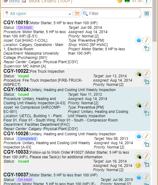
Then we come to the list itself
We display the basic information about the work order. Important note: The exact text and buttons that show up on a line will vary depending on the module you have and, more significantly, depending on what your administrator has turned on or off. So you might not see the edit (pencil) button if your administrator figures you can just use the double-click feature to access that functionality.
Turning off more makes your screen 'less cluttered' but generally gives you fewer options for working. This may be something that technicians and administrators need to work together to decide what is best. Note: It is very possible for different people to have different features/information showing up on the list items.
Notice that there are 3 bands of color that rotate. This is to make it easy for your eye to determine what text goes with which work order.
The first line of data contains the work order number, work order ID, and the 'reason' for the work order. (If too much for your screen width, it will wrap)
In the middle we have several 'small' items of data such as the Target date, Assigned date, priority, Type, Shop, Project and more depending on what has been filled in for this work order.
On the right are several buttons which give info and let you control what you see and more.
You will notice that a couple of the WO's are expanded to give more information and the others are smaller. This was done by clicking on the icon with the 2 blue squares.
You probably won't care or worry about it, but notice that the icon with the 2 blue squares is different for each type, the 'bold' size shows you what will happen if you click on it. So if the large one is bold it means clicking on it will make it bigger, expand it, show more information. If the small square is bold (easier to see that the large square is not bold), it means that clicking it will make it smaller, collapse it, show less information.
The specific information that shows up depends on what information is available for that WO and whether it is in the expanded or the collapsed state.
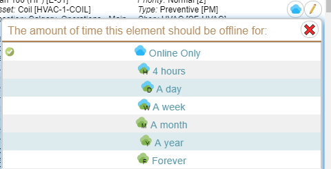
The cloud icon (Green or Blue above) shows the status – whether it is offline (on your device) or only on the server. Clicking on it will either give you the ability to offline it for a period of time, or if it is 'required' to be offline then it will give you a message that you cannot change the state. If you can change it, the choices show you what the icon will see.
Note: We did have some people complain that 'the text on the buttons is the same for every row – why do you have this icon if everything is the same'. That can happen if ALL your WO's currently visible are forced offline. If you really are in a situation where all your WO's are always forced offline, then your administrator can remove this button so it doesn't take up any space on your screen.
On the left, again depending on what has been filled in for this work order you see the Status, the name of the procedure, the asset, the asset location, repair center and Metrics (info that gives you a quick idea what is inside the work order. So you see on the CGY-10033 example that there is very little in it, just 1 task.
Clicking on the edit icon (the yellow pencil with pink eraser) will take you to edit all the details for this work order, let you add photos, edit tasks, set the status, complete the work order, give commentary on the work done and so on.
Next let's look at the Sort
The older sort (prior to 8.0) was VERY limited It let you pick ONE thing to sort by, and it was always ascending. That was it.
The MCe 8.0 sort was not as pretty as we wanted it to be, some say it was ugly. (I'll bet you'll never hear Apple admit something like that!) We had a choice: Ship it and give you the power but a slightly ugly and UI, or leave you with the older, not nearly as powerful way. We decided to give the feature, document it and give a better UI for 9.0. The good news: We presented the newer, better UI with 8.1.
So let's first take a look at it overall, then we'll look at how to do what you want to do with it.
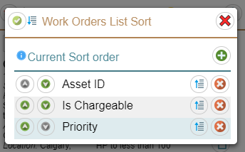
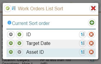
When you go into the Sort (from the 3 dot hamburger menu) you are presented with the current sort order. In the screen to the left, we are showing a sort order that is based first on AssetID, then on whether it is chargeable, then priortiy.
The plus button lets you add more criteria.
The green up and down arrows on the left beside each sort item lets you move them up or down in the list.
The blue 'sort direction' icon on the right beside each sort item lets you sort from highest to lowest or lowest to highest.
The icon with the arrow pointing down tells us that currently it is sorting in an ascending order (A then B … Z) If there is a number, we do an 'intelligent' sort, so none of this 1 then 11 then 20 then 21 stuff. We do 1 then 2 then 3 …10, 11, 12…20,21,…100 and so on.
If you click on the icon in will now point up meaning it will do a reverse sort (Z, Y, X, … C, B, A or 100, 99,20,5,4,3,2,1)
The red x on the right beside each sort item lets you remove it from the sort order.
In general, sorting on one, two or three items can make sense, but very seldom will it make sense to have more than that – but your situation may be one of them. Something to be careful of though, once you have something that is different for every row, any other sort orders will have no effect.
So for exmalpe on this one, there is only WO that can have a specific ID, so this wil only sort on ID, the others will have no effect. Also notice that in MC many 'dates' are actually date/times with a resolution of 1/1000th of a second. So most 'dates' will also uniquely identify a row.
Some common sort orders for you to consider:
- Priority then Target Date
- Target date
- Create order (PK). (This is the order that they were created on the server, so sync'ing can affect the order – because it will be the order they were sync'd, but in general the order they were created in is a common way people like to filter.)
- Priority then Create order (PK) (Since every WO will have a different value, it never makes sense to put anything AFTER Create order (PK).
- ID
- Priority then ID (Again it doesn't make sense to put anything after ID since they are unique – they will always define the filter order.)
- Category then priority the target date then target hours
While we give you lots of fields to sort on, most of the fields will almost never be useful for sorting (but once in a while …) Most of the fields are more useful for filtering.
Footnotes
-
1: It is called the 3 dot hamburger menu because it used to be common to have a 3 LINE menu that was called 'the hamburger menu', the idea being the top and bottom lines looked like a bun and the middle line looked like a hamburger patty (or veggie patty if you prefer.) Wikipedia article on the history of the hamburger menu ↩