Maintenance Connection Everywhere (MCe) · EAM/CMMS manuals
Common Icons
 Used to delete a row or cancel a popup or other similar delete/cancel type actions.
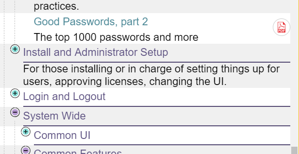
 A green circle with a plus sign, sometimes with the word 'Add' beside it. The add shows up when there is enough room, and auto-hides when there is not enough room. It is used to add another 'item' of the type.
 Similar to the Add button, the Back Button sometimes only has the arrow in the green hexagon, or, when there is space, it shows up with the word Back beside it. It takes you back to the previou page. Such as going from an edit page to a list.
 Top of the page icons
Most pages have these icons:
Sometimes you will see  in front. This means that it is currently saving your last change(s) to the local database.
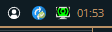
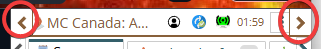
The circle tells you about the status of syncs, the yellow  says there are pending changes, a blue
  means there are no changes waiting to be sent and no sync is happening, a green
  says that changes are, right now, being sent; that is, a sync is currently underway. If you start a sync:
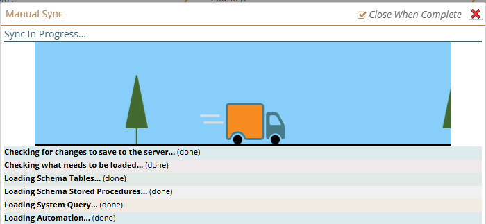
Then click on the red X to close the sync window, you will see the green sync icon until the sync is done. You can click on the green sync icon to go and re-open the sync dialog and see the current status of the sync.
The connection icon: (Briefly. More details in a separate document)
 This icon tells you that the last time we checked (we typically check every several seconds or any time we need to talk to the server) your connection to your server was working correctly.
 This means that you manually disconnected. This means we can't talk to the server because you have told us not to. This will save battery power and conserve cost data charges and, if your internet is flakey (on and off a lot) or very slow, this may speed up a fe different things because we won't even try to connect to get more data.
 This icon means that the last time we tried to connect to the server it wasn't available. It normally means that your internet connection is not working.
 This means that we have tried over the past couple minutes and haven't been able to connect to the server. As above, this normally means that your internet connection is not working.
 Three dot hamburger menu
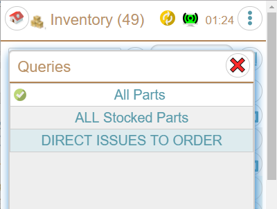
If this button is here, there are some other features related to the current page that are available, things like changing the sort order, creating a New Service Request.
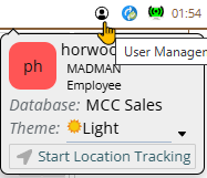
The user button gives you access to several functions that are user specific, such as the dark or light theme. You can also click on your name or fields in that area to access your profile.
Other common buttons
 Barcode entry
Fields with this icon can have values entered in by barcode. (Most fields can by going to edit and there will be a barcode button there, fields that we think barcodes will have particular value have them right there. It is available on all devices, so if you have a laptop camera or a USB camera, you can use it.)
Special note: This is a good time to mention again that Administrators can turn off features, so if your company doesn't use barcodes – turn them off for now and they won't use up any screen space.
See a separate white paper for lots of useful info if you want to use barcodes. How to set up, which codes to use and why and much more. This document only talks about the different UI locations for barcodes and the subtle differences.
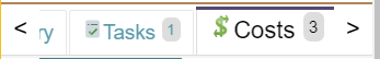
When tabs don't fit across your window
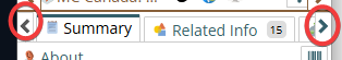
By clicking on the teal arrow heads
When all the panels don't fit across your window
The gold arrow heads let you move side to side to see the panels. A typical layout is:
List or Tree or Map in left panel
Edit page in second panel, this does not show up until you pick something from the map/tree/list
Preview or other info in third panel, not all modules have these and they don't show up until you select something that belongs here
Report in next panel, if you open a report for the item being edited, it shows up in the next panel
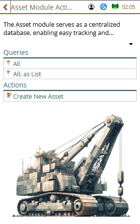
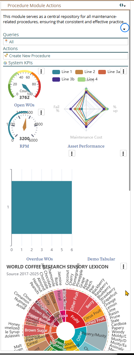
Action Panel shows up on the right. It contains potentially many things including KPIs. And don't worry, while we are proud of our module images, and they can help you keep track of which module you are working in - if there is more information in the top than room on the window, the image will scroll down out of your way.
Such as the following where the KPIs take up enough space that the module image is scrolled down out of sight - your KPIs are more important than our module image.
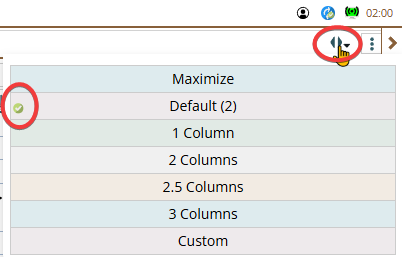
As in the image below, the two solid arrow heads allow you to set the panel width for those times you just want more (or less), this feature is more and more valuable the larger your window is. There is a green circle with a checkmark that shows you the current selected size.
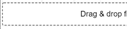
Drag and Drop target
If you see a box with a dashed outline, like below, it is a Drag & Drop target, meaning you can drag and drop onto it. Otten a drag and drop target can also be clicked to do things like choosing a file
Underlined mean you can edit it
The 'way' you edit will depend on what type of data it is, text, numeric, list, multi-select list and so on.
Closing a popup
If it is a single select popup list, simply selecting a value will close the popup.
Others, like text entry, require one more step from you:
If you want to cancel your change – click on the red X in the upper right
If there was data in the field already, there will be a clear button (as above), click on it, the value will be removed and the popup closed.
If you want to save your change
- on iOS the only option is to click on the green check mark.
- On all other platforms, you can click on the green checkmark or you can click anywhere outside the popup – for example, and this is a great idea, click on the next field you want to edit , or click on a save button, or just click on any emply spot outside the popup.
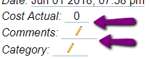
Pencil underlined when no data there
When there is no data in a field you can edit, it is underlined and shows a pencil so you know you can click on it to edit it.
Standard entry popups
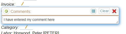
Text entry
Here I cilcked on the comments edit area.
Simple lists
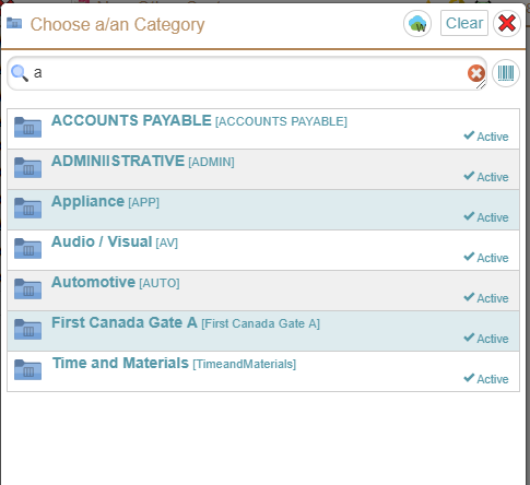
The cloud icon shows you how much longer the list will be stored on your device before it will no longer be on your device, in the case above, it will stay on about a week. If you have a value chosen already, the clear button will unselect it (clear it). The filter lets you select only those that match a pattern, in the case above 'a'.
The specific info shown in the list will depend on what data, obviously the list above shows for Categories.
This is a simple (single select) so clicking on an item in the list will select it and close the popup.
Greyed out elements
If a button or field is 'greyed' out, it means it currently is not available, see troubleshooting section for ways to figure out why if it isn't immediately obvious to you.
Trees
 If you have delete turned on for whichever module you are looking at, the red circle with an X will delete it (with whatever warning level you have set up.)
 This says 'the object is offlined on your device and if you click it, it will take you to edit it'.
 This says 'the object is not on your device, if you click it, we'll try to retrieve it from the server so you can edit it'.
 If you click on this one, it will give you more information. What exactly shows up when it is open or closed depends on what your administrator has set for you to see there.
The circle, the brown ones in the case above, with the + means there may be 'child' records inside it. (usually it means we know there are children, but depending on state of sync it may be we don't know yet)
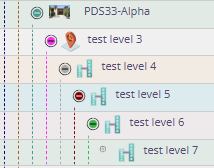
The circle, blue above, with the – means you are seeing everything at the next level inside it.
 Other rows have no + and no - in a circle, they have a dot in a circle. Those mean
You can double click on a row in a place where it is blank, or click on the edit icon (any with a pencil) to edit it.
Tabs
The currently selected tab has a dark line on it (see the Details tab above), the tabs you can select do not have that line. If there are too many tabs to fit on the screen (most common on a cell phone in portrait mode) there are arrows pointing to the left or right to access those tabs.
Top tabs and bottom tabs are very similar, notice that the dark line is at the bottom on bottom tabs and on the top on top tabs.
Info buttons
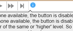
Anywhere you see an info button (the letter i in a blue circle) if you click on it, you are provided with some contextually relevant information. If you are new to a page – you might want to click on any info buttons you see.
Resizing a window
On many devices, like an IPhone, there is no way to resize a window except by rotating the device (assuming you have the system feature on that allows rotating to change the view)
On other devices, like an iPad Pro you have some ability such as rotating or switching to half srceen for the application, and on a full computer (aka Windows), you have extremely flexible options for resizing the window.
In most cases, we handle a resize fine. In particular, making a screen 'shorter' there are, at time of writing, no known issues. But there are other issues, mostly minor, and mostly when making the screen width narrower.
Many popups won't resize until you open them the next time. Consider this:
Window wide:
Window made Narrow while popup open
Popup closed and reopened
There are very few of these 'issues', if you come across others, let us know and we will either fix them or add them to this manual. We don't consider minor ones like this to be a bug – we actually know how to fix it, but the result will be very poor performance (very slow) as we have to check a lot of things on a regular basis to see if a resize has occurred in a way that would affect it. Part of the problem is that when a resize occurs, we can received 100's of 'resized a little bit, resized a little bit more, resized a little bit more' while you are resizing, and if we tried to completely resize everything perfectly, the performance of the resize would be very slow – possibly several seconds.
Our lists are also optimized for speed and sometimes draw wrong
In an interesting twist, also to give you the best possible performance, we occasionally have problems with drawing things incorrectly. We are continuing to avoid this as much as possible without making the system so slow you won't like it. Because of the complexity, our tree structures are most susceptible to this. Consider the following I was able to reproduce in our documentation system.
Interestingly, often resizing the widow width (rotate the screen twice on a phone) will usually fix this. (A drastic resize and then going back to your original size is the most likely to 'fix' it.)