Maintenance Connection Everywhere (MCe) · EAM/CMMS manuals
Into
Have you considered that Radio buttons, Checkboxes and Dropdown lists share a lot in common and are to some degree interchangeable?
Here is how we think about them and the thought we go through when designing screen layouts.
TWO choices, possibly with null
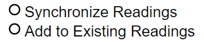
If you have two known choices and "one and only one" or "none or only one" must be selected, you have three major options for UI design, a radio button group, a checkbox or a dropdown.
A checkbox uses the least amount of space and is ideal for anything with a yes/no, True/False question, and some on/off questions.
It isn't bad for 'null' as a 3rd option but it can be confusing with a null value. It only requires one click to make a choice normally, and one or two clicks when an initial value of null, depending on which value you choose. Setting a value back to null is also tricky. Either you have to allow for a rotating set of values of 3 (not user friendly) or you have to have a clear button. So it is best used with nulls only when you can set it to true or false, but it never makes sense to set it back to null.

A Radio button group is ideal when the choices are hard to explain with a header and then values.
A starting value of Null is VERY obvious – nothing is selected, but it is VERY difficult (impossible without a clear type button or a 3rd radio button) to SET something to null. It uses the most space by default. It always, only requires one click.
Another not bad way is like we do with Track Meter 1 History. We have a checkbox to decide whether the radio buttons are in use. This is usually an intuitive UI.

A Dropdown is close in size to a checkbox before you select, so smaller than radio buttons. It is a good choice where a 'title' can explain the choices. It has the disadvantage of requiring 2 clicks to make a choice.
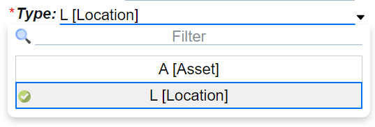
A drop down is often the best choice with null. You either have 3 values in the drop down, or you have 2 values and a clear button. Both are often easier to understand than nulls with Radio buttons or Checkboxes.
TWO choices, possibly with null
Checkbox now usually is not an option. Although sometimes 2 checkboxes or 1 checkbox and a radio button will give the desired result.
A radio group of 3 is 'obvious', but it does take up more space, again, only requiring one click..
A dropdown of 3 is very space conserving but requires 2 clicks.
THREE or more choices, possibly with null
The more you add, the more a dropdown list looks like the best choice, and radio buttons or other choices become a space wasting with not enough value. Not always … but generally a dropdown list is best.
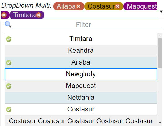
TWO multi-select choices, possibly with null
Radio buttons cannot help here.
A list of Checkboxes are worth considering. Think about a list where you click on the checkboxes on each row you want to perform a function on, then you hit delete or a button to perform some action on all the selected rows
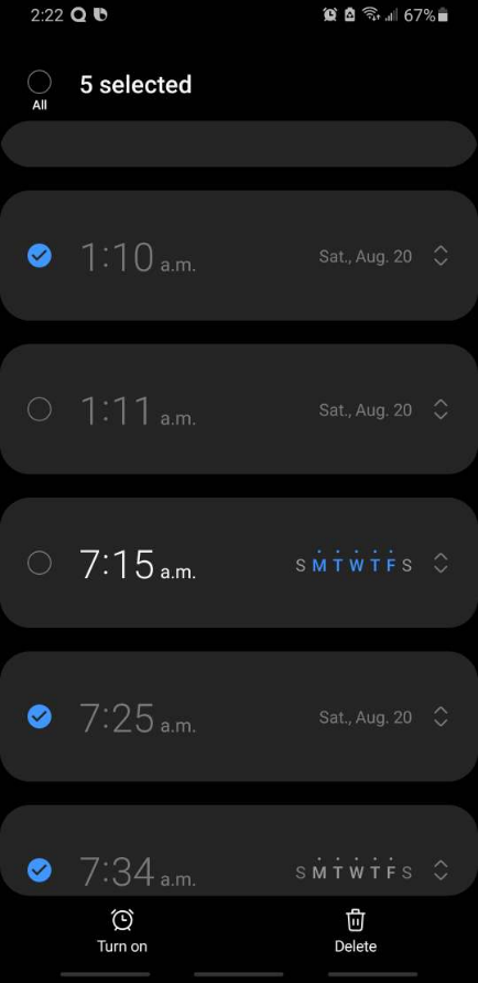
However, please NEVER do it like the Android Alarm which uses radio buttons visually to be checkboxes.
Side note: Google often plays with 'radical' (read: usually stupid) design ideas, keeps them for a few years then reverts to the 'correct' way. Think about their experiment with "Material Design" where a bunch of artists in Google decided to break 100's of years of UI in paper and computers, and treat 'greyed out' as 'something you can select and type in' because it looked prettier. They did this for a couple years, and after suckering in many unthinking or junior developers to follow their lead they then decided that changing the meaning of 'greyed out' was a bad idea, and they stopped doing it – leaving all those unthinking developers with their terrible copycat design. (Noting many of those unthinking developers also worked for Google – so there are still artifacts of that bad design in the Google world, circa 2022)
This some artist in Google decided "use radio buttons for checkboxes because that 30 years of 'radio buttons are round' and 100's of years of 'checkboxes are square' should be thrown out because radio buttons are prettier" will hopefully go the same way soon. In any event – just like we never fell for the 'a field that is greyed out is one you can type in, and a button this greyed out is one you can click'
A multi-select dropdown also works. The display uses less space than a list of checkboxes, so that it is its main benefit.